Thomas Scholes opens up the fascinating pages of his sketchbook, and shares an insight into his techniques and inspirations in this archive article from issue 103!
Discover the concept explorations, designs and abstract sketches of Thomas Scholes…
The act of consistently pulling a unique vision from the ether, no matter how rewarding, can still sometimes be an exhausting one. As a concept artist this is our task day in and day out, and for me sketching is a bit of a welcome release, one that I often light-heartedly refer to as therapy.
Sketching is like a safe haven that I can retreat to where there is no brief, no deadlines, no revisions and no expectations. Often free even of my own desires and expectations, these sketches are created simply because of my desire to create. They are the purest form of my pursuit of a journey where the destination is inconsequential.
©Thomas Scholes
Sketching techniques:
Many sketches start simply with a mark, any mark will do. From this mark an image will evolve organically, reacting to its neighbors and the whole. Others are more abstract, subtle explorations of simple subjects and the fundamentals of design. Some are explorations in maximum efficiency of line, stroke and shape. Most are predominately directed by composition and only a select few start with questions seeking answers.
Borders are utilized to serve as parameters for composition, allowing for accurate judgment of each element’s relation to another. At times their individual qualities can direct an image’s progression and without them cohesion is lost.
It’s not often that these sketches find new life as paintings, as their intent was never as such. However, occasionally I will sketch in preparation for an illustration, but this will generally take the form of crude shorthand, like mental notes.
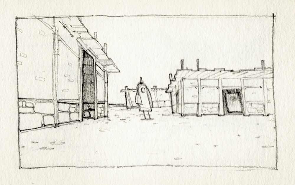
1: A sketch concerning spatial and diminutive rhythm, and an example of an early exercise in my recent re-focusing on perspective.
©Thomas Scholes
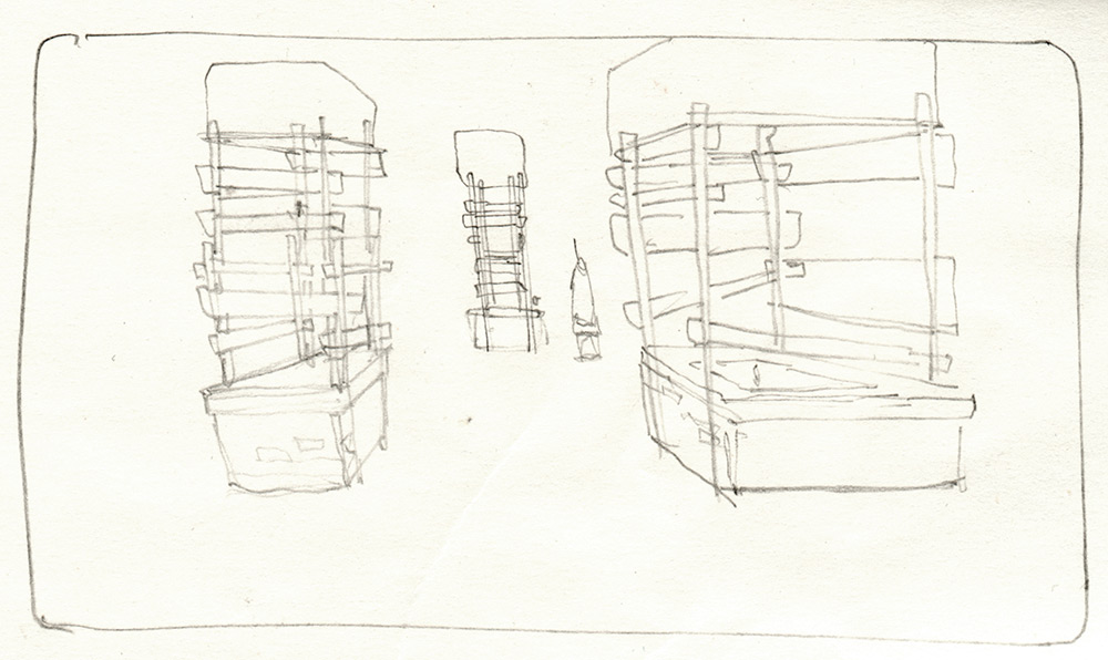
2: Simple and to the point, but with a compositional balance that implies future movement of both figure and frame.
©Thomas Scholes
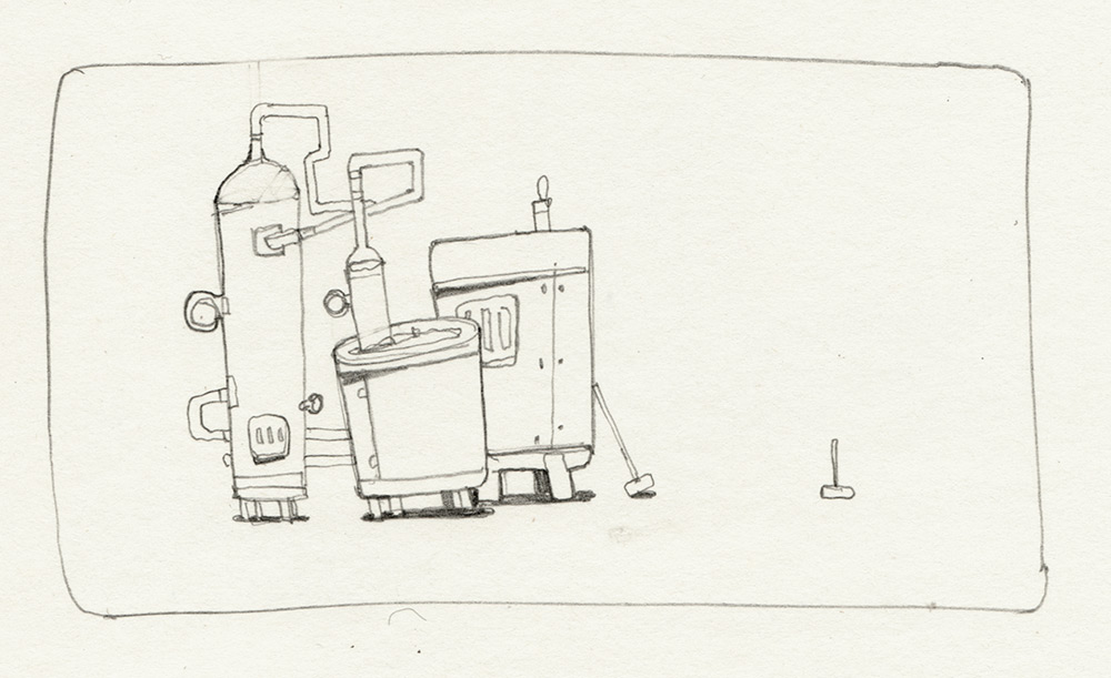
3: Machine as Abstraction: The pipes in this image have been created and placed in such a way that they balance one another. This is a liberating way to design even concrete subjects.
©Thomas Scholes
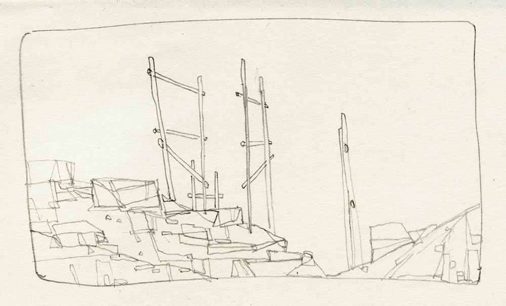
4: Rhythm of Rotation: An illusion that is reinforced by our brain’s clever ability to reconstruct what is not apparent, which is an engagement that I believe is soothing to the audience.
©Thomas Scholes
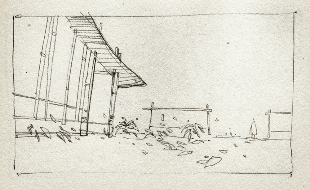
5: It can often be valuable to create subjects that leave the composition visible, which is something that’s easy to forget. In this image most lines, both real and imaginary, lead to the figure.
©Thomas Scholes
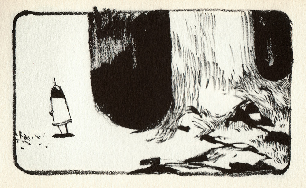
6: This image is an exploration in negative space and a lack of overlaps, which creates an intriguing spatial puzzle. Here emphasis has also been placed upon contrasting areas of texture and rest.
©Thomas Scholes
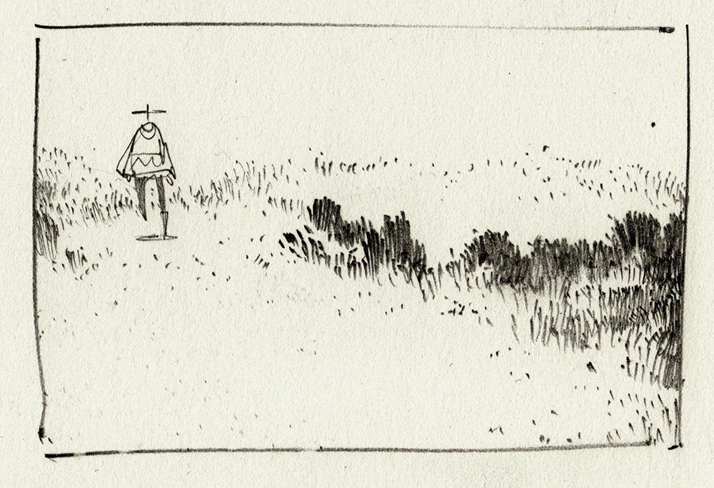
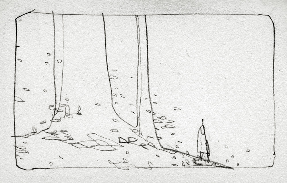
7: This is a shot composed with quite a low horizon, which only exposes a small amount of the terrain. A sense of downward movement is implied as a result and is also accented by the abstracted foliage.
©Thomas Scholes
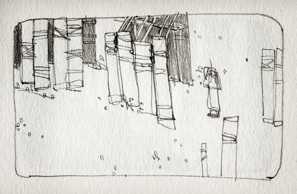
8: The shapes, masses and position of the focal point in this image have been composed to push the viewer’s gaze outside of the frame, encouraging them to follow the figure along its future path.
©Thomas Scholes
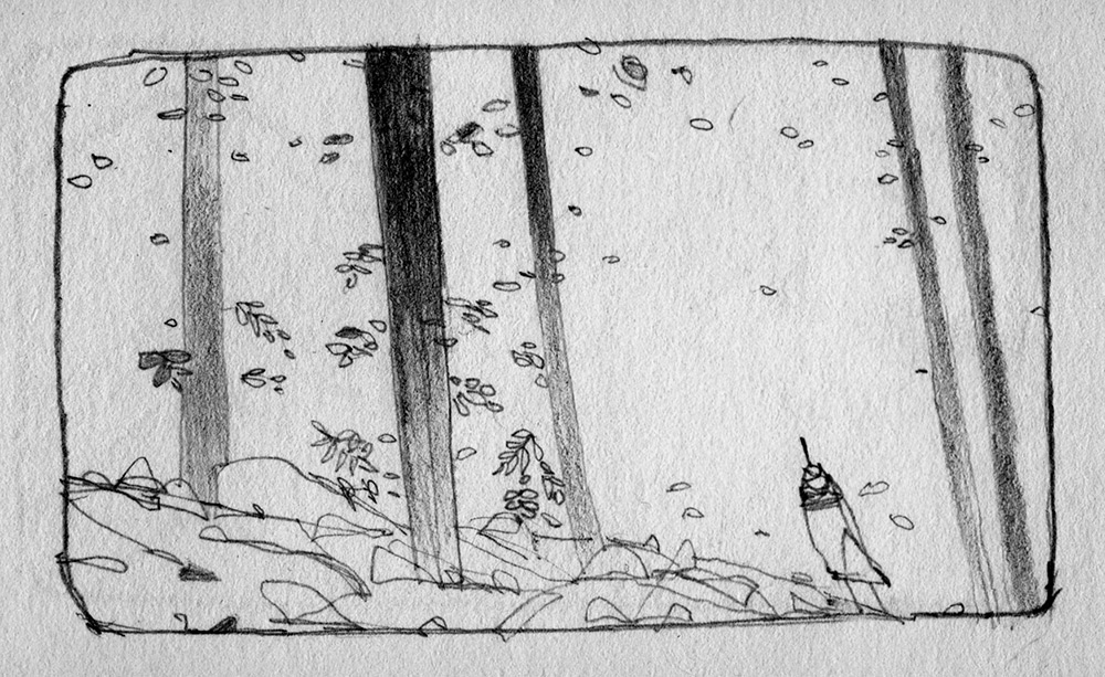
9: It can be pleasurable to dance back and forth when drawing, utilizing something like foliage to balance a composition. Instead of just erasing mistakes, why not see if you can balance one mark with another?
©Thomas Scholes
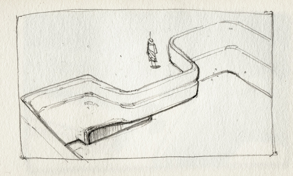
10: At times, my sketches will take the form of artistic exercises that subtlety reflect any particular skills or areas that I feel need to be honed within my painted and professional work. In the example shown here, I was working on improving my understanding of spatial construction.
©Thomas Scholes
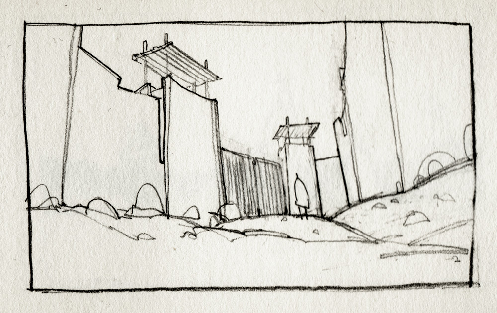
11: It’s of particular interest to me how often the golden mean ends up being present even when a sketch is created instinctively.
©Thomas Scholes
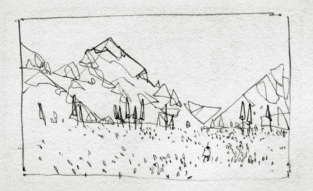
12: In this sketch I have utilized empty space to draw the attention of the viewer to the singular figure in the foreground of the image. The major masses and edges present also serve to create a similar effect.
©Thomas Scholes
13: At times it can be really nice to just slow down when drawing and take some time to think about the significance of every single stroke, value and texture that make up the image.

©Thomas Scholes
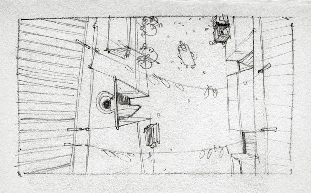
14: This image is one in a series of drawings in which I explore the use of uncommon angles of perspective. I find that in most of my sketch sessions I’ll continually revisit a specific theme until that theme results in either stagnation or satisfaction.
©Thomas Scholes
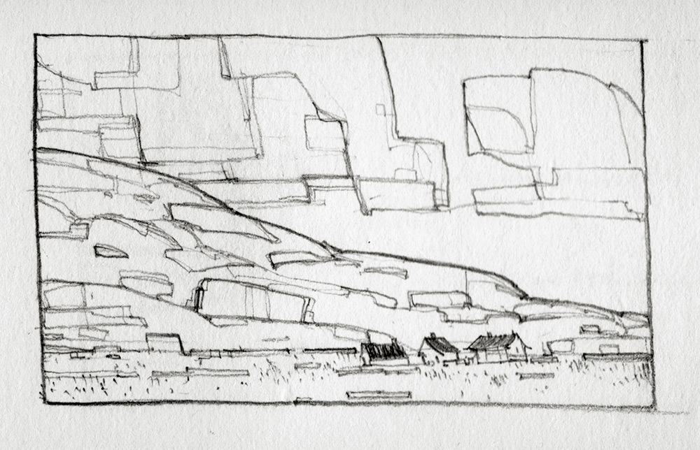
15: A sketch showing an exercise in style. In the example here the emphasis has been placed on shape, to create the impression that the image has been rendered with a thick, blocky brush.
©Thomas Scholes
